Everyone’s favorite display font turned 100 this year. Cooper Black made a splash in 1922, and it continues to appear all over the place. Bouncy, fun, and a little off-kilter, the typeface has been used in everything from the album cover for Pet Sounds to advertisements for Dr. Pepper.
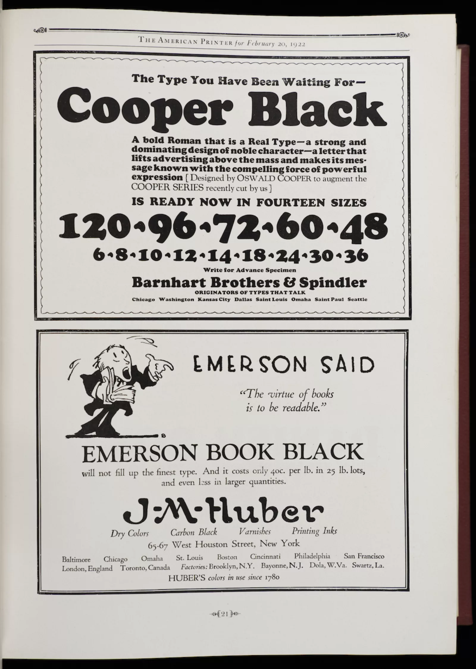
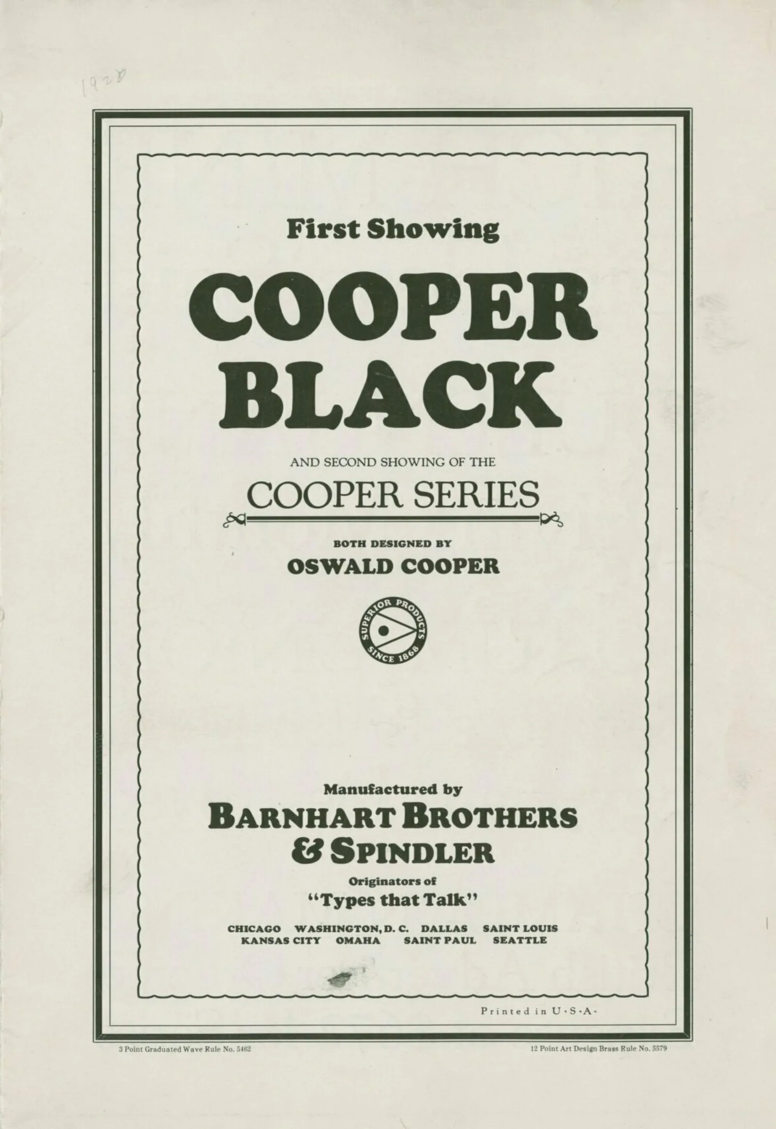
Barnhart Brothers & Spindler, the Chicago affiliate of the American Type Founders Company, announced the arrival of Cooper Black with an irreverent bravado that would become a signature characteristic of the typeface.
Running ads in The American Printer, Barnhart Brothers & Spindler referred to Cooper Black as “a bold Roman that is a Real Type—a strong and dominating design of noble character—a letter that lifts advertising above the mass and makes its message known with the compelling force of powerful expression.”

This was no empty promise. The words, printed in Cooper Black, really do jump off the page. Compared to the other industry ads in the February 20, 1922 issue of The American Printer, Cooper Black just looks…new. Everything else looks old.
It still looks new. One might be forgiven for thinking of Ben Jonson’s famous line about Shakespeare: “He was not of an age, but for all time!” Cooper Black lives in the eternal present. It was designed 100 years ago; but it looks like it was created last week.


“ He drew and redrew some letters dozens of times in the hope of giving the type, a necessarily mechanical product, some of the fluidity and bounce of his personal lettering style.”
Paul Gehl
Wing Curator Emeritus
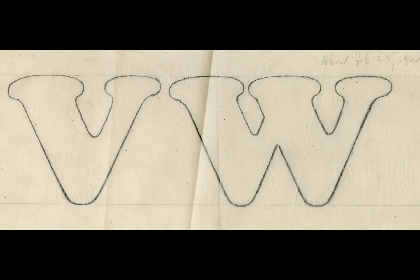
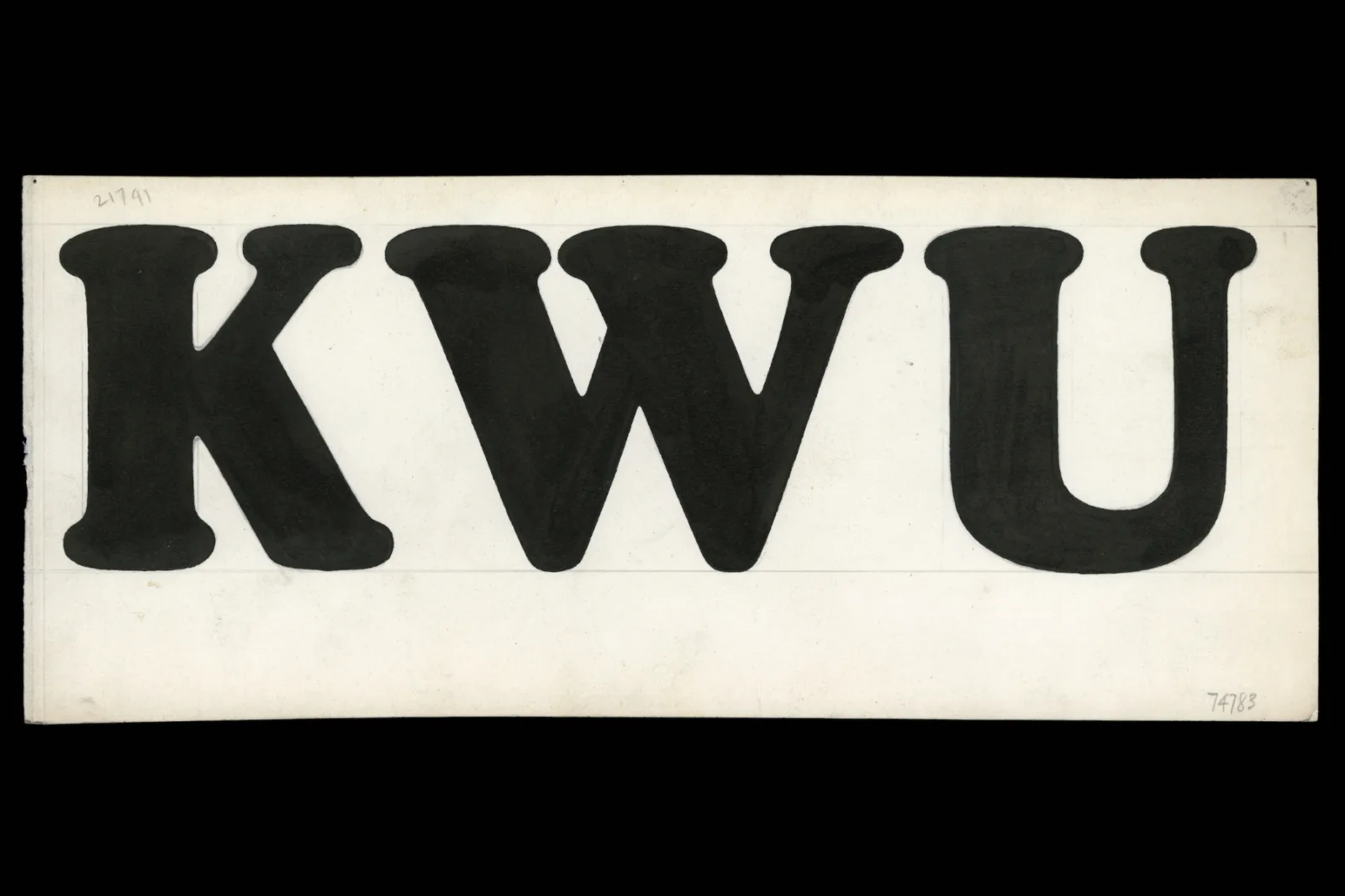
The buoyant expressiveness of Cooper Black is the key to its enduring appeal. Designer Oswald Bruce Cooper worked hard to make sure the typeface’s distinctive personality came through in every letter. “He drew and redrew some letters dozens of times in the hope of giving the type, a necessarily mechanical product, some of the fluidity and bounce of his personal lettering style,” writes Paul Gehl, the Newberry’s Wing Curator Emeritus, in The Newberry 125.
You can see the typeface take shape in Cooper’s sketches, drawings, and proofs. These archival materials can now be found in the Oswald Bruce Cooper papers at the Newberry.
Cooper spent three years perfecting Cooper Black. Advertisers have spent 100 years using it.

About the Author
Alex Teller is the Director of Communications and Editorial Services at the Newberry.