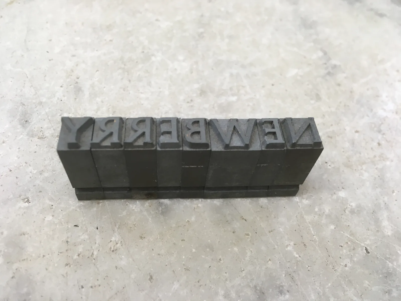
Imagine you’re a Newberry librarian, circa the 1920s, and you’ve been asked to retrieve some obscure tome from the collection. Sounds pretty romantic, right? You grab the call number, make your way toward the nearest collection room, and crack open the door, preparing to be dazzled by shelf upon shelf of beautifully bound volumes. But you’re confronted instead with murky darkness.
That’s because in the days before reliable electrical systems, the Newberry’s collection rooms were enshrouded in only the dimmest light, making the basic task of finding items a challenge of Herculean proportions. Many a toe was stubbed and an eye strained before curators realized that something had to be done to make identifying items easier.
Re-labeling materials with an easy-to-read typeface was one way to address the problem. Thus was born the Newberry’s own typeface, “Newberry Bindery” – or “Newberry Detterer,” as it would come to be known.
The typeface’s official name pays homage to its creator, Ernst Detterer (1888 – 1947), a calligrapher and expert on the history of letter forms and the curator of the Newberry’s John M. Wing Collection on Printing and the History of the Book from 1931 to 1947.
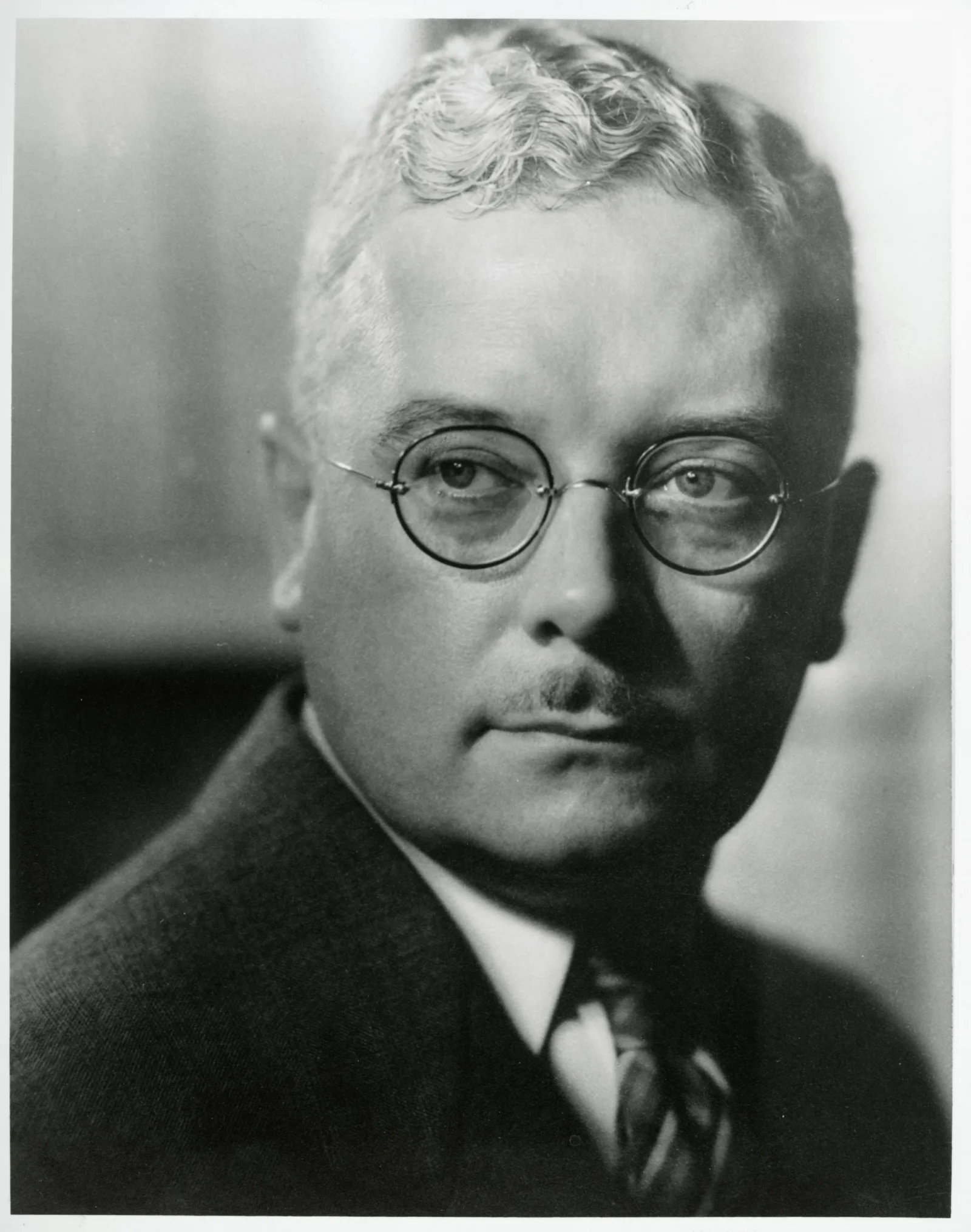
Not long after becoming Wing curator, Detterer set about designing a typeface that would simplify operations at the library.
On the one hand, he sought a face that would be stylistically consistent as well as easy to set for typesetters in the Newberry Bindery (the department then responsible for binding, re-binding, and titling incoming items). On the other, he wanted a face that would be readily decipherable in the low light of the collection rooms.
Detterer seems to have begun envisioning the precise contours of this new, functional typeface in 1933, mocking up and revising the design with the help of Robert Hunter Middleton, a former student of his and the principal designer at Ludlow Typograph Company in Chicago. Together, the two came up with a design that would meet the library’s needs.
To ensure stylistic consistency, the typeface included no lower cases letters—only capitals—and was “self-spacing” (that is, it didn’t require additional spaces to separate letters), allowing bindery workers to set titles as efficiently as possible.
To make titles easy to read in bad lighting, the typeface incorporated large, open letter shapes that would be immediately visible.
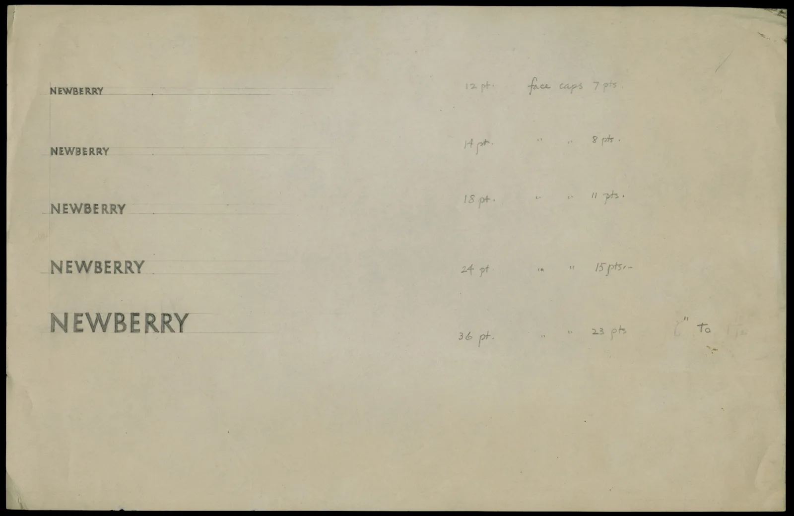
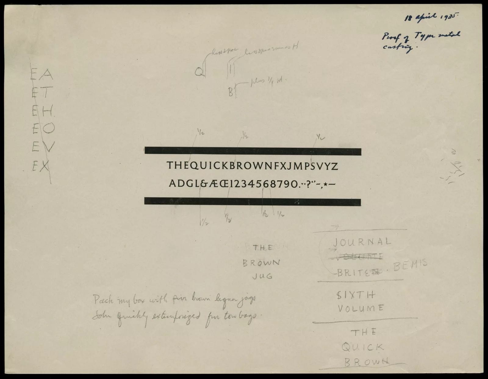
Once Detterer and Middleton had sketched out their design, they settled on a set of font sizes—12, 14, 18, 24, and 30 point—and Ludlow created type matrix patterns for each. Ludlow then sent the patterns to a local engraving company, Weibking Engraving, which used them to fashion type matrices, which were sent in turn to the New Jersey-based company American Type Founders, where they were used to cast finished type that was delivered to the Newberry for inspection.
The process wasn’t without hiccups—correspondence in the Newberry Archives records mishaps and miscommunications of all sorts between the various parties involved. But by around 1936, Detterer had received a set of types suitable for his purposes, and the Newberry Bindery was soon putting them to good use in its custom-designed bindings, as well as on book boxes, signage, and other materials.
Since then, the typeface has become a vital part of the Newberry’s visual identity and has been employed by third parties as well. (Sometime in the ‘50s or ‘60s, it was released by Hass Type Foundry of Switzerland under the name “Newberry Detterer,” and in 2013 it was digitized by artist and graphic designer James Goggin for use in non-Newberry publications.)
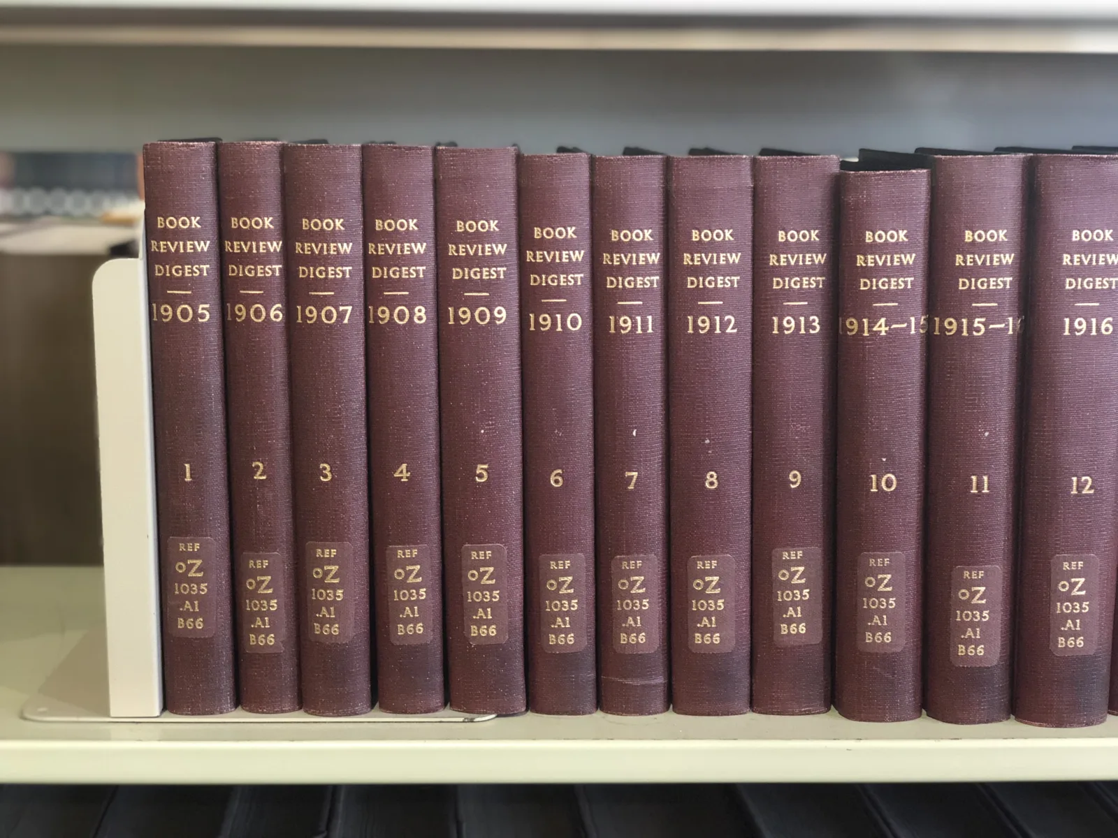
These days, the face is ubiquitous in the signage around the library, and though the Bindery has ceased to exist, our Conservation Department continues to use it to title freshly created boxes and newly bound books—though the welcome installment of modern lighting systems in our stacks has made our staff a little less dependent on immaculately readable typefaces!
About the Author
Matthew Clarke is the former Communications Coordinator at the Newberry.
